Sub App Redesign
How this helped?
- Now the users can independently work on just the required product.
- As just a single module will be running at any particular time.
- The software will be light and fast to use.
- User friendly design help people easily work with any product without training.
Introduction
My Role
- Understand the current products
- Simplify Complex workflow into a User-Friendly Experience
- Make the entire array of products to have same look and feel
- Prototype, Wireframe and UI development using SCSS, Angular, DevExtreme Grids and Bootstrap.
- Created icons for the products
UX Challenges
UX Goals
- Split the big application into small functional independent software to be used independently.
- The products need to be intuitive without any need for special training.
- Have separate modules but still look like a family.
Research & Findings
I along with an entire marketing team of 7 people did a competitive analysis with more than 20 competitors and analyzed what products they offered for shop floor as well as nesting and also how many of them provided web based products and what features were available in the web applications.
During the study I also kept an keen eye on how competitors had provided with the User Experience and User Interface
Scope of My Project
- Market analysis showed that we had a good family of products available which almost served all the possible needs of any shop floor based companies who worked on cutting machine software.
- They need to be simple and user friendly so that we reduce the need of training while selling our products
- Some functionalities were missing which we planned on incorporating
User Research
We had data available from the feedbacks and service reports that was collected through years. We used this data to understand the user needs. This data also provided with the type of machines and environment on which they were working with. And we had expert products owners who knew the major pain points of the users as they visited the user premises and also provided them with trainings and licenses.
Pain Points
- All the applications were desktop based and licensed hence dedicated users had to be stationed at the machines.
- If the application or machine gets crashed it was very difficult to restore the data
- Applications had poor GUI.
- Processes were very complicated and rigid
- Practice and training was needed to make the software work seamlessly
- Products had same logos but the software overall had different branding
Process
We started the process by creating a common point where in we will allow the user to see all the products that he is using from the organizations family of products. This was also helpful in marketing the products that were available that users didnt purchase but might wish to use or are tempted to use in the future.
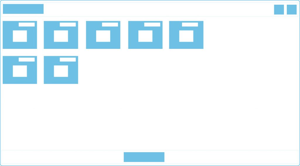
Dashboard
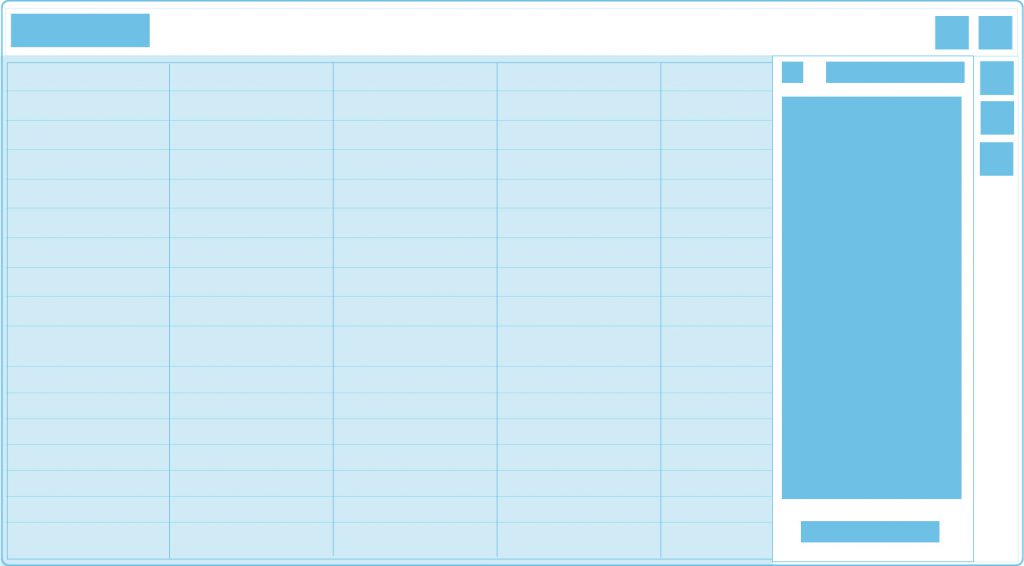
To accomplish this I decided on making a dashboard where in you can see the list of products and give small description of the products and will also indicate if you already posses a license for the products, as well as the type of license available.
It also acted as a navigation point to access the products which was not available earlier and acted as individual entites
We designed new set of logos for each product. I was a major part of this process. Where I competed with my design head for proposals of logo designs and won the case 😀
Hi-fi design options for the dashboard
Proposed different layouts on how the dashboard can we displayed.
Also proposed on how to show if the user had license for the products.
Split into Sub Products
The stakeholders discussed and decided on dividing a large product into smaller products as then they will get simple to understand and the organization can earn more revenue by licensing them separately.
This was not only beneficial for the organization but also for the users as they can buy only the features that they are in need of.
We started with simple products first. Where a linear step by step method was used to accomplish the final task.
I had been assigned a product expert who would explain me detailed working of the product. Along with the stake holders we all deduced what workflow would make an independent product. Then we defined different user flows available. This made the ideation process easy.
Ideation
As we had to make family of products we decided on creating a design template for different kinds of screens and flows which will make the product consistent and easy to use and reduce learning curve of the users.
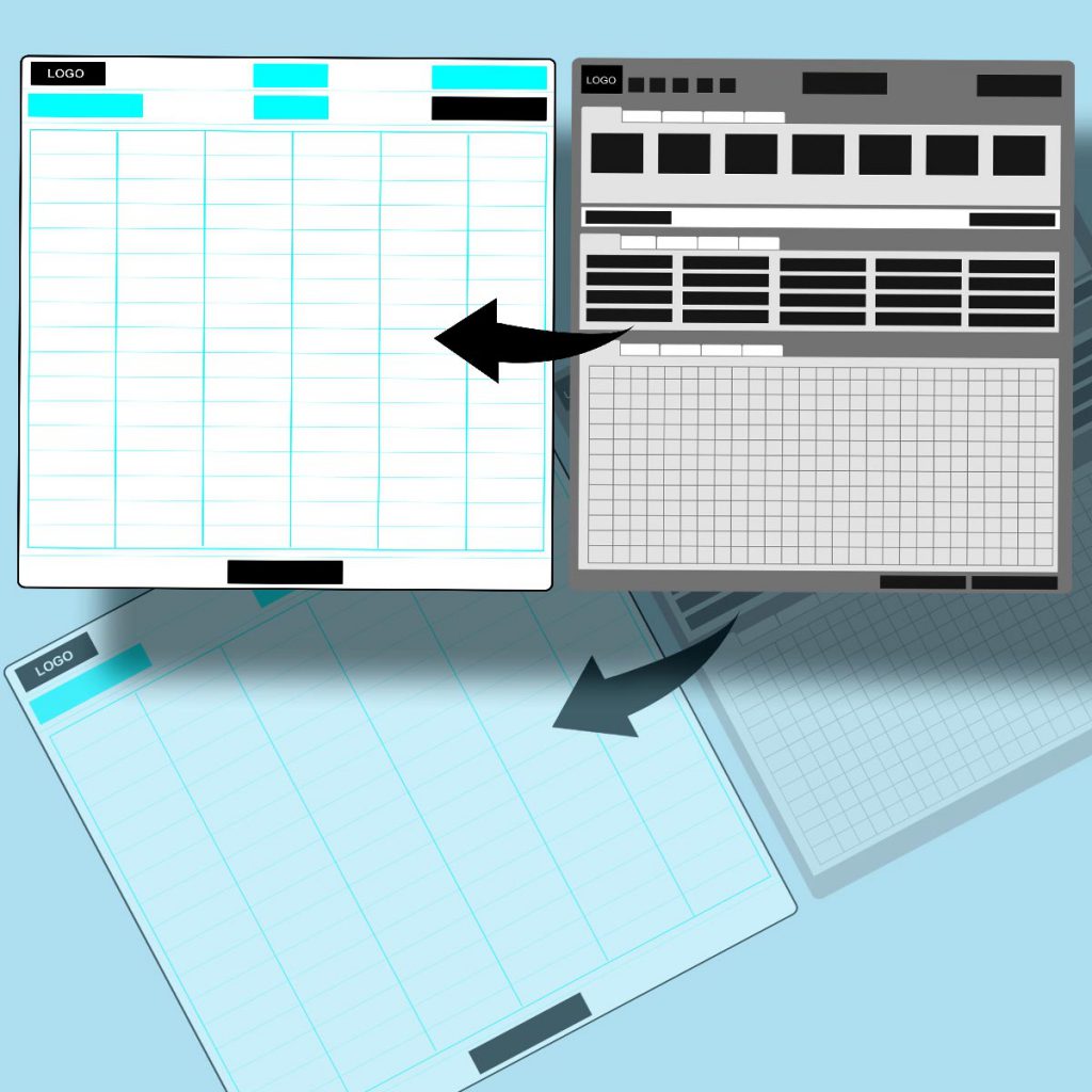
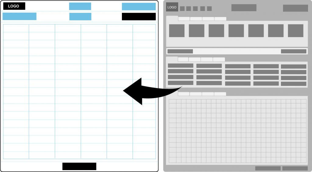
I came up with 2 initial ideas. Where I took care of keeping the design simple to use. To achieve this I proposed on putting all the action buttons on a toolbar and keeping the main area to show the grid (data table), as the grid was the main component were the operators would see the valuable information or data of the shopfloor process they are working on.
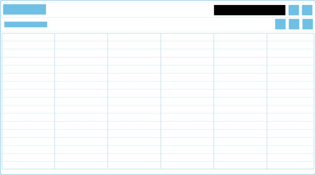
Design I
In the first design I provided the toolbar at the top, clicking on the action would open up popup to feed in the input wherein we can feed in or edit the required fields.
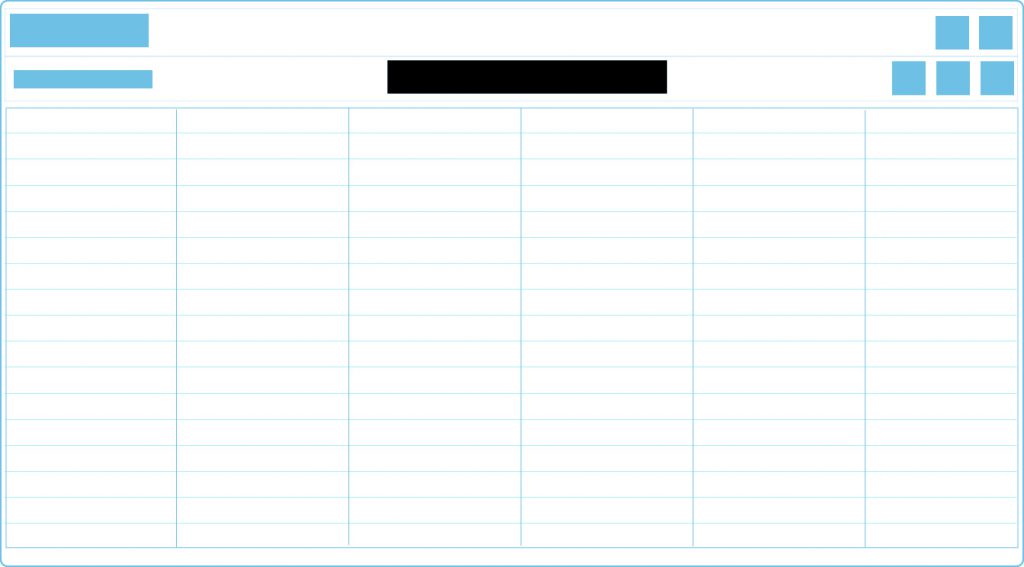
Design II
In the second design I provided the toolbar on the right, clicking on the action buttons in the toolbar would open a side panel wherein we can feed in or edit the required fields.
Once the design was approved, I was given tour of the products and parallelly I would make the wireframes and once the wireframes were finalized, I would develop the UI for the product and then start on with the next project. We went ahead with the first design.
Increase in complexity
While we went on to more complex projects, we understood that some products had progression that must be shown to the users. So, then I started ideating for this need to be incorporated in the design.
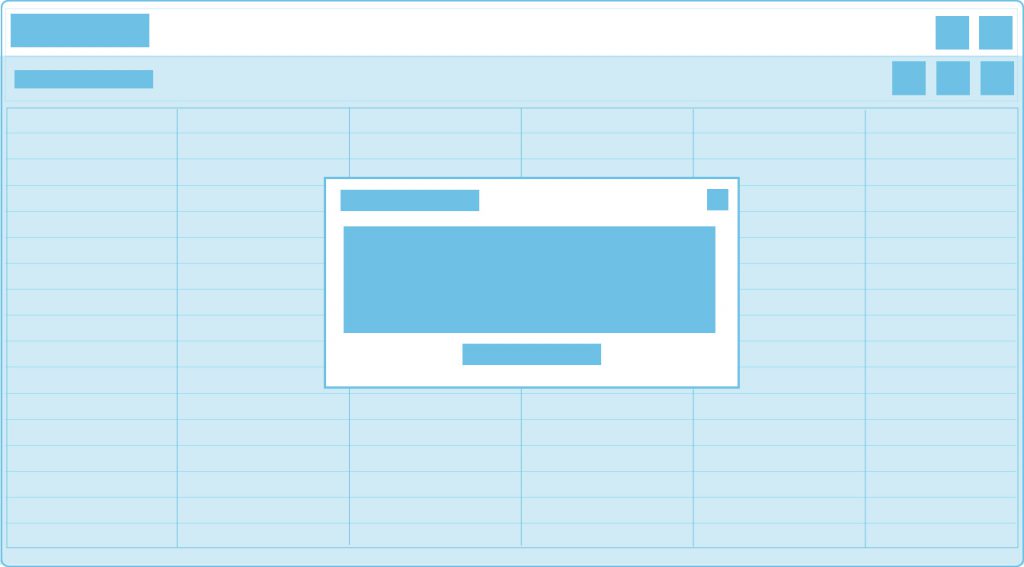
We decided on adding steppers to the product. I came up with 3 different positions where this stepper can be placed in the selected designs.
Design I
In this design the stepper was more like a breadcrumb and placed in the main heading of the product.
Design II
In the middle of the toolbar.
Design III
At the bottom of the application.
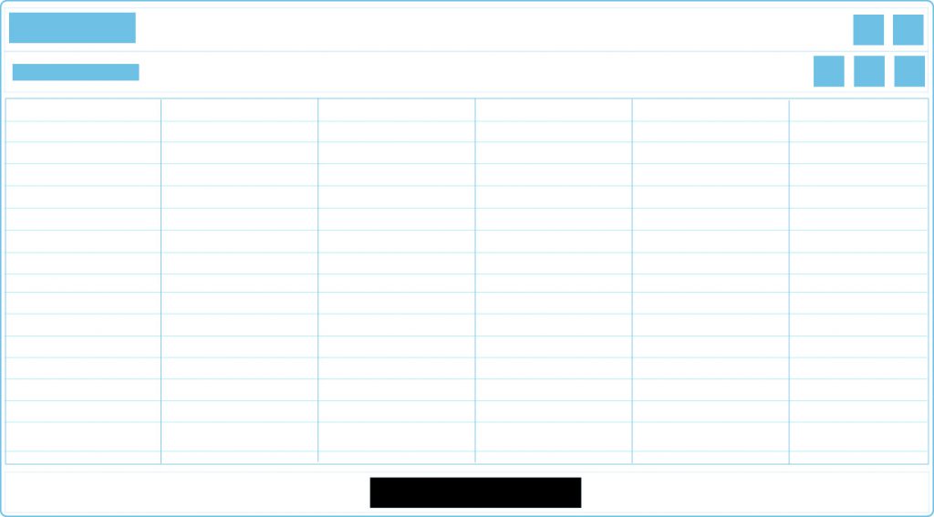
We decided to go with the bottom option as then it will also be accessible on different viewport sizes
It was fun to overcome the complex challenges which came ahead ....
Conclusion
- While redesign anything properly understanding of the original product is very important, lack of proper communication can increase the work and the time estimate too then elongates.
Once decided on a particular design patterns, at times it is difficult to fit in all the functionality in the same prototype, wherein then we need to introduce new concepts that can best fit in the concept.
While backend has been developed, we do need to be ready to incorporate new concepts.