Sanctioning Application for Employees and Customers​

Sanctioning Application for Employees and Customers

How this helped?

  • Improved entire software so that it was easy to use for the internal team members who had to sanction 1000’s of profiles everyday.
  • Improved functionality for adding of Customers, Members list and Users
  • Improved functionality for adding of Customers, Members list and Users
  • Improved Reports.
  • Reduced manual work.
Sanctioning

Introduction

This company had a software built by developers. And hence had a very old-fashioned UI with no UX.

Internal Users found it very difficult to work on and had to do a lot of manual work though they had a software for sanctioning and licensing

My Role

  • Did User research. Took interviews of the employees using the software
  • Did an expert review of the existing application
  • Created Persona from the research
  • Created new improved IA for the system
  • Created task-flows and defined user stories
  • Did ideation by creating paper sketches of important screens
  • Did wireframing of all the user stories
  • Worked with visual designer to make sure the usability is ensured even during the visual designs.
  • Once the product was developed did Usability testing of the product

Research & Findings

User Interviews

I along with my UX architect and Lead Designer started with User Interviews 

Persona

From the User interviews we created a persona of applications user

SanctionCheck Persona

Pain Points

  • Manually editing huge entries in case of format errors which is a time consuming activity
  • Handling different platforms such as outlook, SC portal for task completion
  • Due to insufficient information user had to put extra efforts to check additional info like SSN, EIN, etc on different portals and validate it back on SC
  • To and fro communication with Support team and dependency for completing the request

Proposed IA

As the navigation and pages of the application were difficult to navigate proposed new IA

SanctionCheck IA

Process

Started with understanding the task flows of the application

User Validation

Validated the pain points, task flows and user stories.

Wireframing

Create Customer

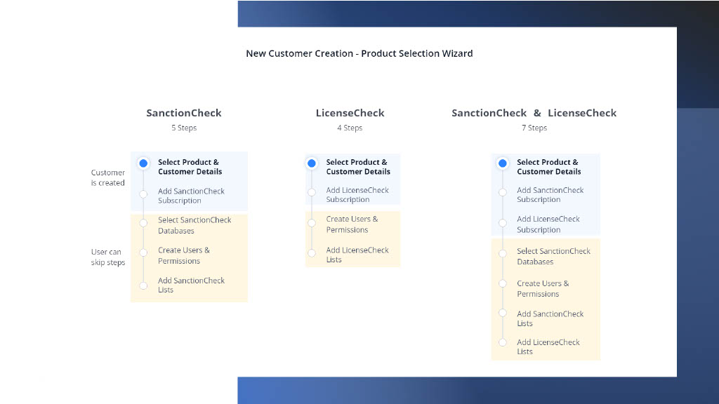
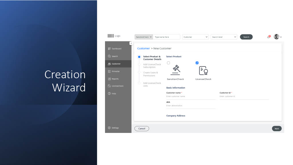
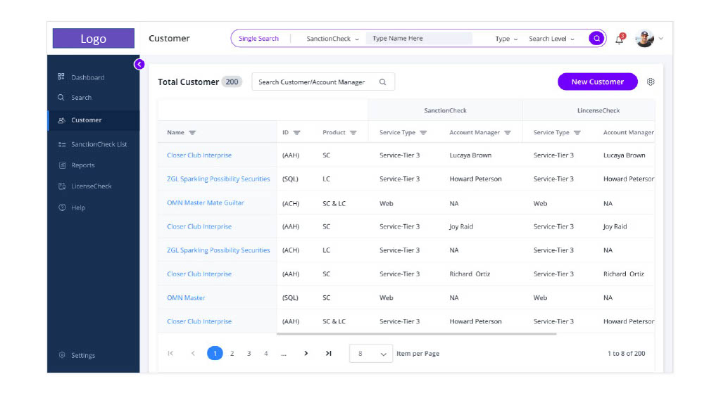
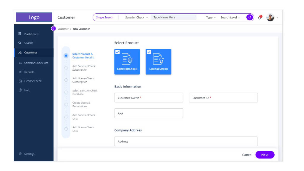
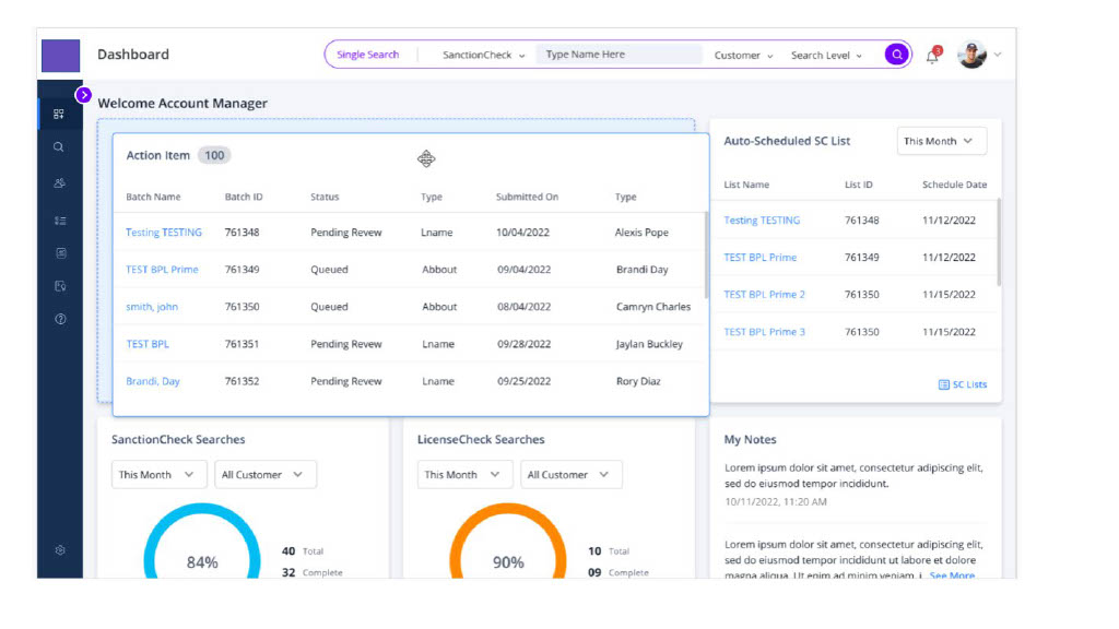
Started the wireframing process from creating customer record. As the this was the first step of the users using the application. I too started with it as the process was a little difficult to understand.

Before this user used to create the customer and then the information was represented in tabs which user could fill up later.

I suggested to make it a step by step process, this will help them to know the next step.

Though user could just create the customer with basic information and if needed come back and add the information. But all the steps need for the customer were made more prominent. So that even a novice using the system for the first time will know what information is needed for a customer

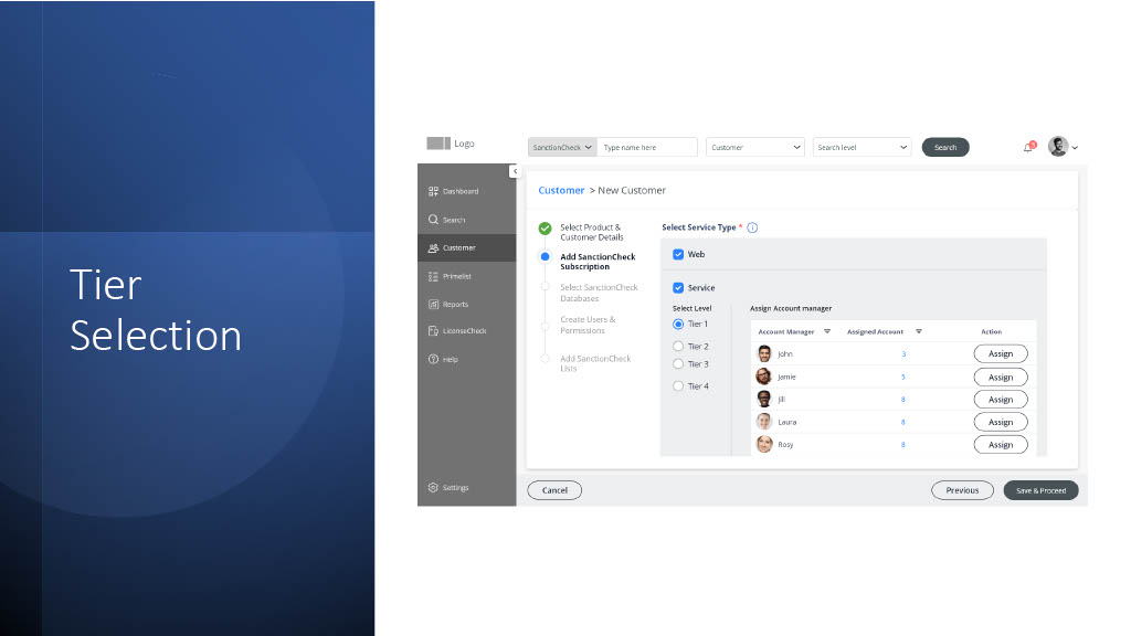
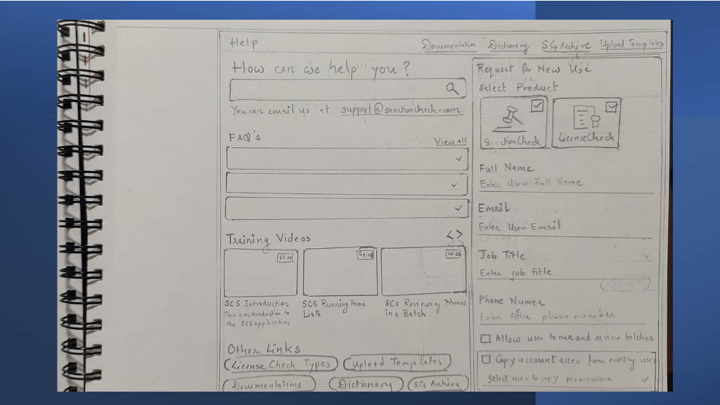
Customers could choose from 2 products and depending on the selection will fill in the further information

Customer Creation

Depending on what you select the wizard steps changed. Also the blue area above in the image shows the compulsory steps after which the customer was created automatically once the user steps to the next step. So even if the user left the wizard they could again go back to the customer and fill in the other details.


Customer creation wizard

Selection of Product

Selection of the product or products is the first step, depending on which further steps change.

Customer Creation Wizard

Global search was introduced in the header as it was the primary function of the application.

Selection of subscription
Subscription

As there were 2 types of customers where customer just do the process of sanctioning by themselves but adding their users (WEB). Or they could opt for service from the sanctioning agency where special account managers where assigned and they would do the tasks on behalf of the customer.

Also in the service there were 4 levels of Tiers available.

For a product subscription a account manager was assigned.

Steps with in the steps

As the addition of customer was a complex task as I described. There were sub steps in the process of creating the customer.

To make sure user knows where they are in the customer creation we added the sub steps in the side drawer where user can view the status in the stepper as well as complete the process easily without leaving the wizard

But yes as explained if needed user can leave and come back as well.

I had made use of the import functionality that I had user tested in my prior organization. When the file is uploaded match the columns. Also we provided users with templet file in the first step so that user just have to add the records in the file and import.

Also additional matching of columns functionality was given so that even if the column sequence was not right the user just have to match the columns and not leave the process or reupload the file.

Search

This is the primary task of the application. Where records are searched in the available databases to further apply the sanctioning status.

While the customer where created or after they were created. Customers(web users) or account managers can upload lists of users (prime list / sanctioncheck list / licensecheck list) and its records were  checked in the subscribed Databases and then was available for further processing by the users.

Users were also allowed to search single records which was available through a detail page or a quick global search.

Showing of lists processed records was an important screen, to make it easy for comparison for the users to take sanctioning decision.


As this is an important step I created paper sketches for this and came up with different options.

Option 1

Card format with percentage of matching information, to take quick decisions

Sanctioning Option 1

Option 2

Table format for easy filtering. But grouping by status.

Search Option 2

Option 3

Grouping by match percentage

Search Option 3

Option 4

I finally created an option where there was a possibility of having a plain grid without grouping as then filtering could become easy and also switch to card view. But later we decided on dropping the card view as well as it was not giving any significant improvement in the usability.


Search Option4

Final Wireframe

Group the records by database was introduced and keep the first and last column sticky so that it becomes easy to compare information and take action.

We also tried different icons for the actions but then we kept the familiar icons at the end.

Search Wireframe

Other Pages

As help, dashboard and some other pages were also a little complex and important created paper sketches for ideas and then created high fidelity wireframes for them

Help page ideas

Help page option 1
Help page option 2

Dashboard Idea

While ideating for Dashboard we had a interesting activity between my Architect, Lead and Me. Where we came up with what all important information we can add to the dashboard and then Dashboard options. Which was a 1 day challenge 😀 and then we took all the important widgets in the dashboard.

Dashboard option

Visual Designs

We had a separate visual designer person who came up with design options while creating the Design system and then collaboratively decided design system. 

I worked with the visual designer so that proper components were used and usability was taken care and also the visual components appropriately matched the over all personality of the software.

Customer List

Grid

Create Customer

Create Customer
Sub Wizard

SanctionCheck List

SanctionCheck List

Search

Search

Dashboard

Dashboard

Help

Other important pages like report and other are not mentioned here but I followed similar steps for them. Create paper sketches if needed and then come up with high fidelity wireframes

Reports were segregated with the type of user and permissions. And only those reports were shown to the user that were appropriate.

Frequently used reports section was also made available on the dashboard.

Users were able to add their day to day notes on the dashboard and email reports directly to the respective people instead of switching between the software

Conclusion

We created a simpler and easy to use software where primary and secondary goals were met by the users in the User testing at the end. 

Hence improved the usability of the software. (This is what a UX designer wants :D)

Future Enhancements

Other products could also be added to the same design.

What I learned?

Designing is fun when we collaboratively ideate and have competitions and criticisms on design

We got best outcome which our users loved.

Leave a Comment

Your email address will not be published.